Infographics: Michael Paukner

To my mind Infographics represent the ideal application of graphic design- as a form of visual shorthand, simplifying complex information while preserving accuracy. At the very least they make scientific data that much more palatable to people who wouldn’t normally take any interest in it. To take this analogy further; they are the delicious cheese of art on the salty cracker of science.
But using statistics in this way requires a certain amount of restraint and integrity because it’s very easy to mislead people with statistics. Misleading or completely fabricated statistics are thrown about in advertisements and tabloid newspolls every day and as designers we carry some of the blame for that. what we should strive to avoid in our work is , in the words of Andrew Lang, the habit of of “using statistics as a drunken man uses lamp-posts. . .for support rather than illumination”.
I think infographics are an excellent way providing illumination on any subject but I held off dedicating a post to these types of graphics until I’d found someone who really stands out from the field.
Which brings me to graphic designer Michael Paukner. I’m not sure where he’s from but a little twitter stalking revealed likes Hockey so I’m just going to assume he’s Canadian. Infographics take all forms; from that little hand-dryer symbol that looks like it dispenses bacon to the food pyramid on the cereal box that puts all your favourite foods on the top. Most of these graphics are just decorative graphs and charts but artists like Michael go much further than that to create something worth hanging on your wall (which is why he’s decided to make his available online).
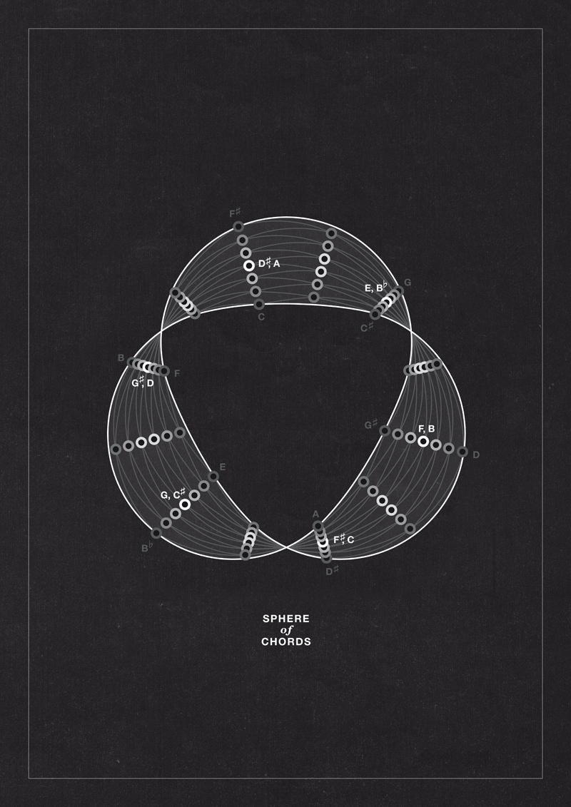
The subject matter varies considerably but there are a great number of infographics dedicated to the esoteric; some dealing with ancient mathematics and astronomy and some with modern pseudoscience, crop circles and prophesies. They form a sort of historical tribute to mistaken beliefs with each image on his flickr page accompanied by an explanation and a date for when these ideas were first conceived of. Sadly the dates for when these ideas are due to expire remain somewhat open-ended.
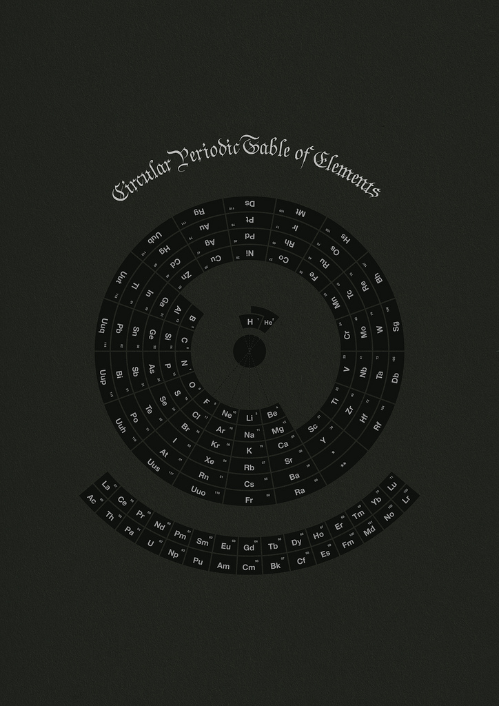
Michael has also uploaded a number of general scientific infographics including a timely comparison of natural disasters over the last century, a comparison of the number of satellites and their nationalities and a map of world showing where the worlds oldest trees are found.
You can visit Michael’s personal portfolio on Substudio.com. There’s a great breakdown of Infographics on Instantshift.com. Other excellent resources for infographics are the Data Visualisation page on tumblr.com and the site Information is Beautiful.


Leave a Reply